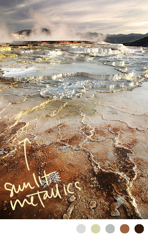
The first time I saw Mammoth Springs in Yellowstone I was blown away. There is an eeriness to it- almost like it's from another world. Combine that with signs telling you to stay back (unstable grounds atop acid are not made for walking on) and you can't help but be intrigued. What's more is that when the sun hits it just right, the whole place seems to glow from within and glistens like it's been dusted by gold and silver. It's absolutely breath taking.
Brown
color inspiration: burlap, boxwood, and beam
foliage and table photo via hoot and heart, chandeliers via abby try again, burlap via the paris apartment
Like those color names? I kind of felt like I was working for a paint company right then.
Color Inspiration: peaceful palette (grey, blush, sienna, blue, cream, mint...)
thread via seesaw, thank you tags via elizabeth anne designs, love ice cream via grey likes weddings, greenery via with this ring
Sometimes I think we can have a tendency to get too wrapped up in specific color schemes and forget that not everything has to be one of three colors or even the same shade of those colors to work well together. That's why I love this inspiration- it's incorporates a range of muted natural colors- mints, mosses, blushes, sienna- and then throws in that pop of blue for good measure. And thanks to none of the colors being too jarring, the effect is incredibly peaceful.
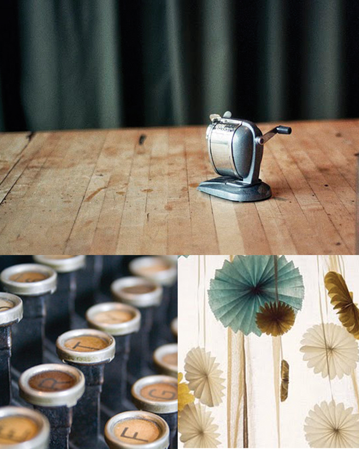
color inspiration: coffee, parchment, and velvet
pencil sharpener photograph via Jen Causey's blog Simply Photo, typewriter keys via peonies and polaroids,the pinwheels photo has been on my desktop for forever, but I've never been able to find where it's from. Could one of you please help me so I can give credit where it's due?
Unlike most people I know, I really loved school. (And I actually mean the school part of it.) Of course, my education was definitely unique so that may be why I have such fond memories of it. I spent 5th through 12th grade at a fine arts magnet school where at any time during the day you could wander around and hear the jazz band, watch dancers practice choreographed routines, see kids painting or throwing pots, etc. Once I got to college, I studied scientific illustration and even though I did have science classes (which was actually where I met my husband), most of my days (and many a week day nights) were spent in the studio joking around with my friends.
Those uncomfortable metal stools with the wooden top? Always reminds me of critiques (and never being able to get comfortable.) Pencil sharpeners? I can already smell the graphite and wood shavings. And no whenever I see a can of white paint, I'm always reminded of the final days of a show when you've taken all the work down and are repainting and repairing the walls for the next one.
While most people I know tried everything to get out of school, I always felt like it was part of me and that I was part of a long line of artists who studied there before me. So when I found Jen Causey's photograph of an old pencil sharpener, I was immediately reminded of studio days in college and knew I wanted to do a board around it. This one in particular reminds me of old wooden floors that creak as you walk across them, parchment and tracing paper scattered across tables, natural light streaming through old glass panes, and the smell of coffee (and quite possibly whiskey from the night before) that was forever lingering in the air. (If you'd like to see our old building, you can view it here.)
And for anyone wondering where the velvet comes in- blame it on elementary school. Anytime I think of velvet I think of a deep green and am reminded of the super heavy stage curtains that framed the little stage in our cafeteria. (Of course those were red I think, so who knows why green comes to mind....)
Color Inspiration: molasses, parchment and slate
martha stewart caramels via ritzybee, landscape via wishfulfillment, dress photo via anna williams (found on city sage)
The snow here is still holding on tight (and by tight I mean it's turned to ice that even the DOT is having a hard time combating) so everything still has a beautiful stillness to it. (If you ignore the people who for some reason think their summer tires are good enough and that by living in Atlanta they somehow have mastered driving in snow. Come on people, you're not impressing anyone and kind of look like a jerk as you spin out and put others lives in danger. Okay, back to the point.)
So when I was coming up with today's color inspiration I wanted something warm and calming. We've had a fire burning pretty much constantly for the past few days and after it's out and we're heading to bed the charred wood has a beautiful slate green grey covering it. I decided to take that color (which impressively is the same color as a field covered with a frozen morning dew) and combine it with a luxurious chocolate brown (oh my gosh that dress is phenomenal) and the color of the parchment that covers homemade caramels (or homemade cookies as in my case) and this is what evolved. (I can almost hear the crunch of the thin ice under my boots and smell the wood burning.)
Stay warm everyone!
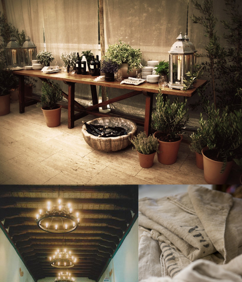
Simple rustic affair
 row 1: photo via snippet and ink
I know a (really) cold front has hit the majority of the country right now so many people are dreaming of sitting by a fire or playing in the snow, but I saw this top image on snippet and ink and haven't been able to stop thinking about it. Since I promised today's post would be "lighter" I figured an inspiration board based on this image was perfect.
This one is all about staying simple and rustic. A lot of natural elements (fresh herbs, the dirt
floors, exposed wooden tables) with touches of off white porcelain and simple laid back fabrics (like burlap and thin white cottons.) As the party goes into the night, I see a ton of twinkle lights hanging from the ceiling and tucked into the shrubs and a family style dinner of different pastas, bottles of red wine, and oven fired home made pizzas covering the tables.
Has anyone else noticed a shift to the "simple" for big events such as wedding? It seems as though more and more people are realizing that the day isn't about coordinated favor boxes and towering flower arrangements, and instead are holding tight to what really matters to them. Personally, I think it's wonderful!
Have a great day, everyone!
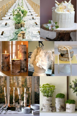
Birch Wedding
I got a message from one of my favorite college roommates* a few days ago saying that she'd had a dream that she got married and there were birch trees all around and thought it would be a good idea for me to write a post about. Well I couldn't agree more! I love birch trees. The bark is so beautiful and I love the clean lines of the trees. I think it's the perfect touch to incorporate into a fall or winter wedding and am so happy S decided to tell me about her dream. Hopefully this board will do it justice!
 row 1: tablescape via bunnycakes, cake via oncewed
*Not only is she just an awesome person, but we also took the same studio art classes together all summer long so I really got to know her better. We had only known each other for a semester when we decided to live together that summer but both wanted to stay in Athens for the summer so we just went for it and found an apt to sublease. Guess it was a little risky, and I can only speak on my part, but I'm happy we took the risk because she was such an awesome roommate! Now she's studying to be a nurse and I am so proud of her! She's going to do such an amazing job at it.
Outdoor Altars
I love the idea of outdoor altars, but can't help but have visions of the tornado from The Wizard of Oz anytime I see something like this. What do y'all think?
who says pumpkins are only for halloween?
I think they make awesome decorations for a fall wedding- esp AFTER halloween.
 row 1: car with pumpkins via real simple, stirrers via oncewed
row 2: boutonniere via martha stewart, country living pumpkin via mintage home, photo via auralee dallas
row 3: cake via oncewed, car via martha stewart
Meshing colors
It's rainy here in Atlanta, so instead of the bright "lemonade-ish" one I had planned for today, I thought I'd do a board with darker, richer colors (Did I mention that I'm also really looking forward to fall?) I designed this one as inspiration for a party, but it easily could be turned into a wedding. On that note, keep in mind that everything does not have to match perfectly. Not only is it sometimes overkill, but there is no better way to get a migraine than stressing over whether or not the green ribbon perfectly matches the green dresses, and if those match the green ink on the escort cards etc. etc. Instead just make sure everything flows together and has the same feel. Just like decorating- the mixing and matching of textures, patterns, etc almost always is more beautiful than having everything identical.
 row 1: i misplaced the link for these homemade chips, anyone know? , escort cards via snippetandink, antique glass lanterns via design sponge
row 3: table via fete
Rose, Stone and Cocoa
I love this color combination- it reminds me so much of Paris. I know it's best suited for a fall or winter event, but I couldn't wait anymore to post it! Together these colors create an incredibly romantic and elegant feel that perfectly mesh together modern and traditional decor. I love the idea of a candlelit entrance as well as simple anemone touches in the centerpieces and on the cake. What do you think?
 row 1: photo via simply seductive, invitation via green wedding shoes
row 3: anemone centerpiece via green wedding shoes, candlelit entrance via fete


