

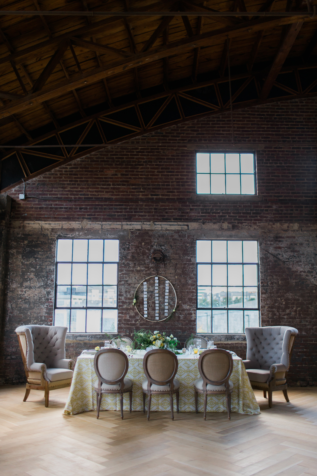
View of the table setting with my custom watercolor wedding menu card | courtney khail watercolors | photo by Elle Golden
The Extras- watercolor escort cards, menus, and table numbers by courtney khail watercolors
Oh the extras. A lot of people forget about these, but it's these pieces that can really tie everything together design wise. You also a little more freedom to play around with pieces like menus or table numbers since there are-usually- less of them and therefore not as visually overwhelming or expensive. Since I've already shared the watercolor wedding invitations I created for the Weddings Unveiled shoot, I thought today would be a great day to share more of the "day of" elements.
For the menus and table numbers, I utilized the same basic designs and artwork as the invitations, but I played with the shapes to give them more visual interest. (If you missed the post on how I created the artwork, you can find that here.) My circular menus fit perfectly inside the (absolutely beautiful) gradient blue plates Raquel chose from Ponce City Market's West Elm, which in turn acted as "frames" for the menu artwork. (Full disclosure, this was actually just a happy accident. I thought circles would be more fun than common rectangle or square menus, not to mention that the artwork really lent itself to the shape so I just went for it and hoped for the best. I had no clue if it would work with the design, but luckily, it worked perfectly.)
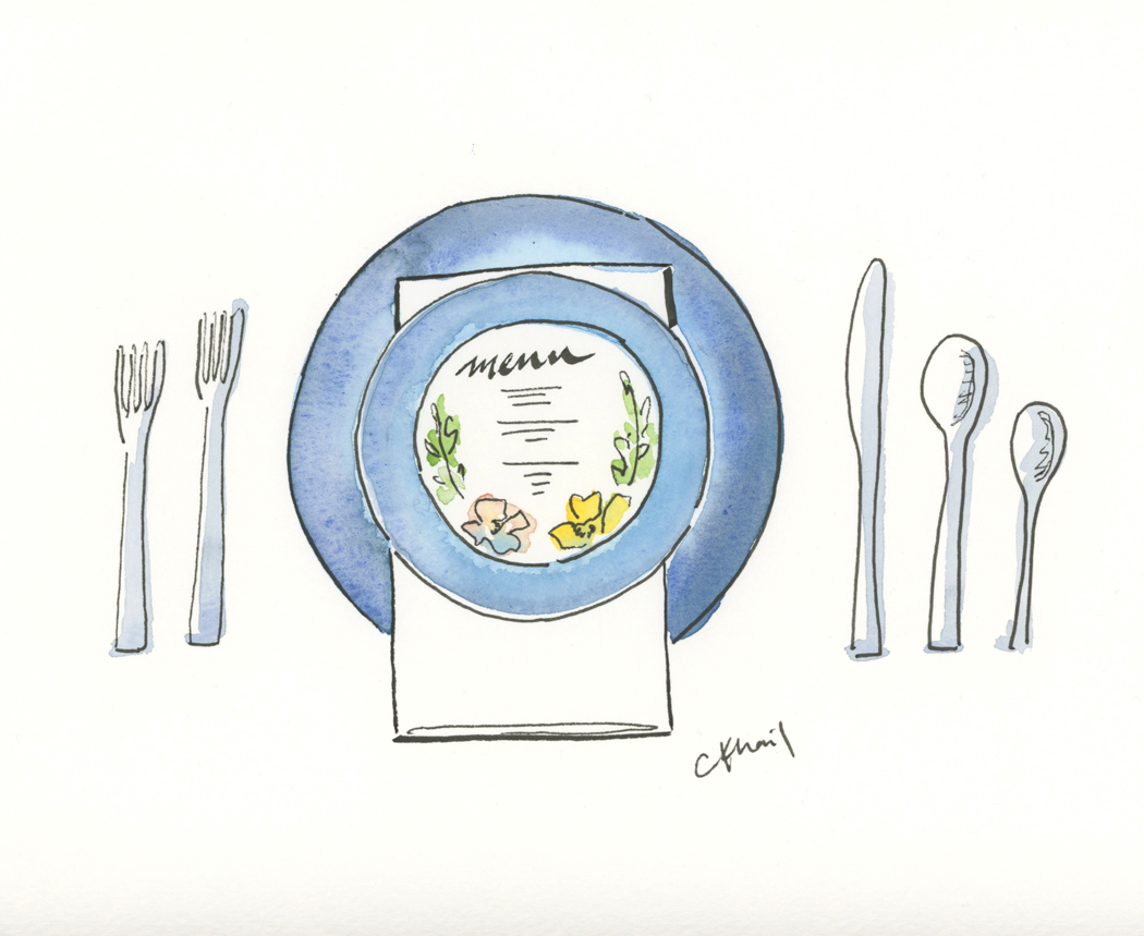
my original sketch for the menu cards | via courtney khail watercolors

The table number was also a spontaneous decision. Originally a square, I thought it needed something so the night before the shoot I started cutting away at the white space. In the end, the cut out mimics the border of the painted "bouquet" and ended up blending in seamlessly to the center pieces. Which was pretty awesome if I do say so myself.

Custom watercolor table number by courtney khail | photo by Elle Golden
As for the escort cards, Raquel told me the idea she had for displaying them, so I knew they couldn't be too busy. By removing the line work, the names (handwritten to mimic the invitation) pop from the paper, while the lighter artwork forms a floating garden when all of the names are arranged together.

View of Table | Custom watercolor wedding extras by courtney khail | photo by Elle Golden

Custom watercolor escort card detail | created by courtney khail | photo by Elle Golden


