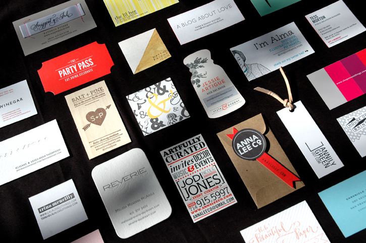
It's no surprise that when attending a conference full of design bloggers you'll come home with a TON of amazing business cards. (I'm actually still finding cards stashed in my purse, in my carry on- I even found a lone card in my coat.) The creativity of these ladies (and gents) completely blew me away. Cards packaged in leather or glassine envelopes, accompanied by sprinkle filled salt shakers, bracelets and mini hand drawn illustrations- they were exceptional. And while I have to admit I normally prefer very crisp, clean designs, these creative minds introduced me to a whole new world of possibilities. Here is a sampling of some that stood out the most to me. That said, every single card I received was beautiful and I wish I could have included them all. Hope you enjoy!
Good Design
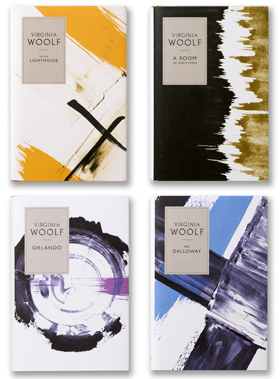
Good Design: Angus Hyland book covers
penguin books found over at jessica comingore's blog
oh these are so pretty. So pretty in fact, I wouldn't even put these in a bookshelf. Nope, these are made for a coffee table. Or since our coffee table is usually pretty full, the "just as special" floor space right by the coffee table. I mean, isn't the floor just one huge table?*
Good work, Angus (and team.)
Correct answer is yes by the way.
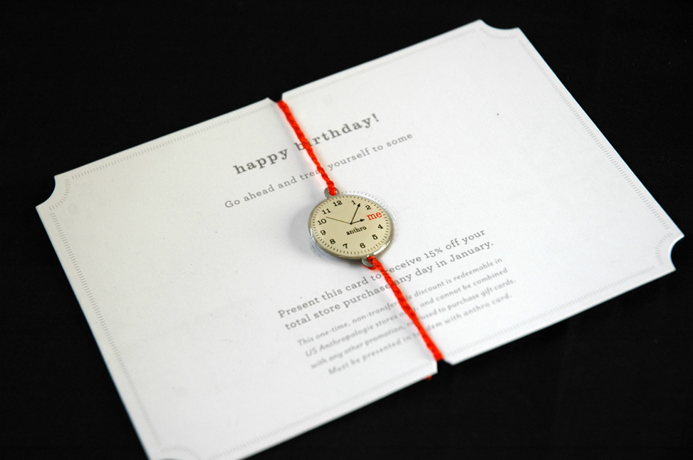
Good Design: Anthro Birthday Card
Anthropology birthday mailer, photo via me
The Anthro team amazes me every year, and this year doesn't disappoint. I especially love the little clock and the pop of orange and the corners.
Good Design: Parking signs
 via for me for you
Oh how I love a good witty church sign.
(Anyone feel the need to shout "YOU SHALL NOT PASS!" like in Forgetting Sarah Marshall? If not, you really should go watch that movie again and try it out.)
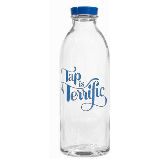
Good Design: Tap is Terrific
via paper source
Because you know when your bottled water says "from a municipal source" it really means "from a tap."
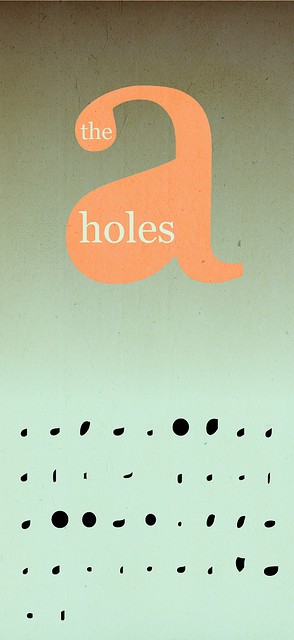
Good Design: The A Holes
Good Design: West Elm Soap
via wit + delight
I love the organic, handmade feeling of this West Elm soap packaging. Designed by Brooklyn-based artist Colene Blanch, it focuses on using simple geometric patterns in a hand painted style- all in a wide range of beautiful grays.
Good Design: Saxton Cider
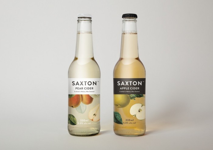 Supply Design for Saxon Ciders via best awards
Aren't these pretty? Classic, clean and elegant-exactly how I like my ciders (Can you call cider elegant? I'm going to. This is elegant cider.) I have absolutely no clue how they taste, but just having them on the counter would be enough for me.
Good Design: Steve Jobs
Thanks for everything, Steve- we owe you so much.
Good Design: Diet Coke
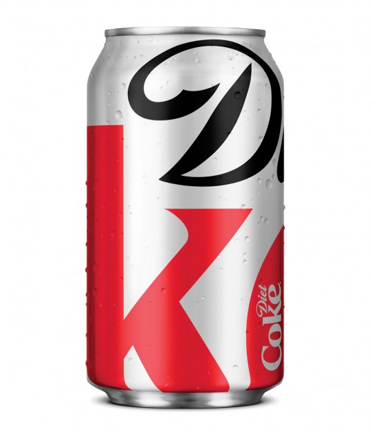
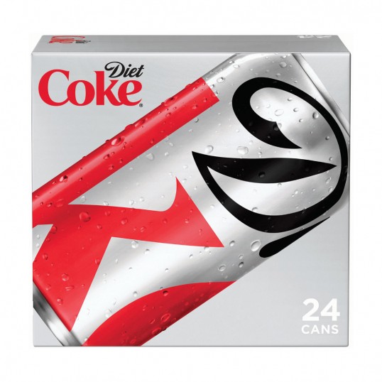
Turner Duckworth redesign of Diet Coke via lovely package
I am an avid Diet Coke drinker (I don't drink coffee so it's where I get my caffeine,) and a couple of days I opened my frig to find that the Diet Coke can looked different-and not just different, but awesome. I love the enlarged logo that relies more on the style of the letters and the colors, instead of the words. I really hope they keep this one around!
A little more info about the redesign:
“The latest evolution in Diet Coke’s iconic “Stay Extraordinary” campaign features a modern new look for fall on the Diet Coke aluminum can and a series of new ads on television and out-of-home. The ads connect with consumers using the witty and smart tone that marks the unique voice of Diet Coke." (I never thought of Diet Coke having a voice, but I'll go along with it.)
"“The new Diet Coke design is at once understated and overstated,” said David Turner, partner Turner Duckworth. “The understatement of a monogram, rather than the full name, and the overstatement of the extremely enlarged logo, both demonstrate the brand’s renewed self-confidence.”
Apparently Diet Coke also rewarded some of their "most loyal customers" with a specially designed refrigerator filled with Diet Coke. I'm going to assume mine was lost in the mail.
Good Design: Viewmaster Invites
via melangerienyc
These are so cool. Really pricey, but how sweet would these be for a 50th wedding anniversary? Your guests could actually see y'all "growing old" together!

